---
productId: material-ui
components: GlobalStyles
---

# How to customize

Learn how to customize Material UI components by taking advantage of different strategies for specific use cases.

Material UI provides several different ways to customize a component's styles. Your specific context will determine which one is ideal. From narrowest to broadest use case, here are the options:

1. [One-off customization](#1-one-off-customization)
1. [Reusable component](#2-reusable-component)
1. [Global theme overrides](#3-global-theme-overrides)
1. [Global CSS override](#4-global-css-override)

## 1. One-off customization

To change the styles of _one single instance_ of a component, you can use one of the following options:

### The `sx` prop

The [`sx` prop](/system/getting-started/the-sx-prop/) is the best option for adding style overrides to a single instance of a component in most cases.
It can be used with all Material UI components.

```tsx
import Slider from '@mui/material/Slider';

export default function SxProp() {
  return <Slider defaultValue={30} sx={{ width: 300, color: 'success.main' }} />;
}

```

### Overriding nested component styles

To customize a specific part of a component, you can use the class name provided by Material UI inside the `sx` prop. As an example, let's say you want to change the `Slider` component's thumb from a circle to a square.

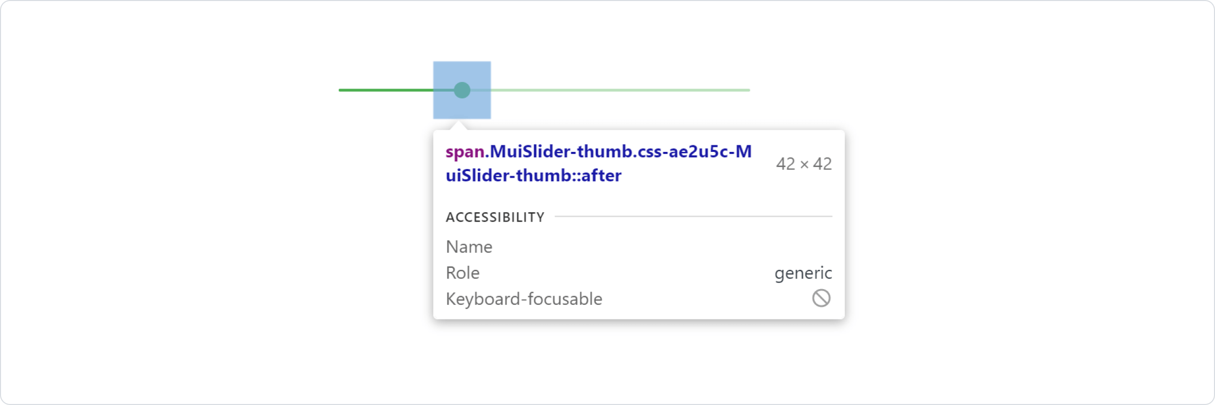
First, use your browser's dev tools to identify the class for the component slot you want to override.

The styles injected into the DOM by Material UI rely on class names that all [follow a standard pattern](https://v6.mui.com/system/styles/advanced/#class-names):
`[hash]-Mui[Component name]-[name of the slot]`.

In this case, the styles are applied with `.css-ae2u5c-MuiSlider-thumb` but you only really need to target the `.MuiSlider-thumb`, where `Slider` is the component and `thumb` is the slot. Use this class name to write a CSS selector within the `sx` prop (`& .MuiSlider-thumb`), and add your overrides.

<img src="/static/images/customization/dev-tools.png" alt="dev-tools" style="margin-bottom: 16px;" width="2400" height="800" />

```tsx
import Slider from '@mui/material/Slider';

export default function DevTools() {
  return (
    <Slider
      defaultValue={30}
      sx={{
        width: 300,
        color: 'success.main',
        '& .MuiSlider-thumb': {
          borderRadius: '1px',
        },
      }}
    />
  );
}

```

:::warning
These class names can't be used as CSS selectors because they are unstable.
:::

### Overriding styles with class names

If you want to override a component's styles using custom classes, you can use the `className` prop, available on each component.
To override the styles of a specific part of the component, use the global classes provided by Material UI, as described in the previous section **"Overriding nested component styles"** under the [`sx` prop section](#the-sx-prop).

Visit the [Style library interoperability](/material-ui/integrations/interoperability/) guide to find examples of this approach using different styling libraries.

### State classes

States like _hover_, _focus_, _disabled_ and _selected_, are styled with a higher CSS specificity. To customize them, you'll need to **increase specificity**.

Here is an example with the _disabled_ state and the `Button` component using a pseudo-class (`:disabled`):

```css
.Button {
  color: black;
}

/* Increase the specificity */
.Button:disabled {
  color: white;
}
```

```jsx
<Button disabled className="Button">
```

You can't always use a CSS pseudo-class, as the state doesn't exist in the web specification.
Let's take the `MenuItem` component and its _selected_ state as an example.
In this situation, you can use Material UI's **state classes**, which act just like CSS pseudo-classes.
Target the `.Mui-selected` global class name to customize the special state of the `MenuItem` component:

```css
.MenuItem {
  color: black;
}

/* Increase the specificity */
.MenuItem.Mui-selected {
  color: blue;
}
```

```jsx
<MenuItem selected className="MenuItem">
```

If you'd like to learn more about this topic, we recommend checking out [the MDN Web Docs on CSS Specificity](https://developer.mozilla.org/en-US/docs/Web/CSS/Guides/Cascade/Specificity).

#### Why do I need to increase specificity to override one component state?

CSS pseudo-classes have a high level of specificity.
For consistency with native elements, Material UI's state classes have the same level of specificity as CSS pseudo-classes, making it possible to target an individual component's state.

#### What custom state classes are available in Material UI?

You can rely on the following [global class names](https://v6.mui.com/system/styles/advanced/#class-names) generated by Material UI:

| State         | Global class name   |
| :------------ | :------------------ |
| active        | `.Mui-active`       |
| checked       | `.Mui-checked`      |
| completed     | `.Mui-completed`    |
| disabled      | `.Mui-disabled`     |
| error         | `.Mui-error`        |
| expanded      | `.Mui-expanded`     |
| focus visible | `.Mui-focusVisible` |
| focused       | `.Mui-focused`      |
| readOnly      | `.Mui-readOnly`     |
| required      | `.Mui-required`     |
| selected      | `.Mui-selected`     |

:::error
Never apply styles directly to state class names. This will impact all components with unclear side-effects. Always target a state class together with a component.
:::

```css
/* ❌ NOT OK */
.Mui-error {
  color: red;
}

/* ✅ OK */
.MuiOutlinedInput-root.Mui-error {
  color: red;
}
```

## 2. Reusable component

To reuse the same overrides in different locations across your application, create a reusable component using the [`styled()`](/system/styled/) utility:

```tsx
import Slider, { SliderProps } from '@mui/material/Slider';
import { alpha, styled } from '@mui/material/styles';

const SuccessSlider = styled(Slider)<SliderProps>(({ theme }) => ({
  width: 300,
  color: theme.palette.success.main,
  '& .MuiSlider-thumb': {
    '&:hover, &.Mui-focusVisible': {
      boxShadow: `0px 0px 0px 8px ${alpha(theme.palette.success.main, 0.16)}`,
    },
    '&.Mui-active': {
      boxShadow: `0px 0px 0px 14px ${alpha(theme.palette.success.main, 0.16)}`,
    },
  },
}));

export default function StyledCustomization() {
  return <SuccessSlider defaultValue={30} />;
}

```

### Dynamic overrides

The `styled()` utility lets you add dynamic styles based on a component's props.
You can do this with **dynamic CSS** or **CSS variables**.

#### Dynamic CSS

:::warning
If you are using TypeScript, you will need to update the prop's types of the new component.
:::

```tsx
import * as React from 'react';
import { alpha, styled } from '@mui/material/styles';
import Slider, { SliderProps } from '@mui/material/Slider';
import FormControlLabel from '@mui/material/FormControlLabel';
import Switch from '@mui/material/Switch';

interface StyledSliderProps extends SliderProps {
  success?: boolean;
}

const StyledSlider = styled(Slider, {
  shouldForwardProp: (prop) => prop !== 'success',
})<StyledSliderProps>(({ theme }) => ({
  width: 300,
  variants: [
    {
      props: ({ success }) => success,
      style: {
        color: theme.palette.success.main,
        '& .MuiSlider-thumb': {
          [`&:hover, &.Mui-focusVisible`]: {
            boxShadow: `0px 0px 0px 8px ${alpha(theme.palette.success.main, 0.16)}`,
          },
          [`&.Mui-active`]: {
            boxShadow: `0px 0px 0px 14px ${alpha(theme.palette.success.main, 0.16)}`,
          },
        },
      },
    },
  ],
}));

export default function DynamicCSS() {
  const [success, setSuccess] = React.useState(false);

  const handleChange = (event: React.ChangeEvent<HTMLInputElement>) => {
    setSuccess(event.target.checked);
  };

  return (
    <React.Fragment>
      <FormControlLabel
        control={
          <Switch
            checked={success}
            onChange={handleChange}
            color="primary"
            value="dynamic-class-name"
          />
        }
        label="Success"
      />
      <StyledSlider success={success} defaultValue={30} sx={{ mt: 1 }} />
    </React.Fragment>
  );
}

```

```tsx
import * as React from 'react';
import { styled } from '@mui/material/styles';
import Slider, { SliderProps } from '@mui/material/Slider';

interface StyledSliderProps extends SliderProps {
  success?: boolean;
}

const StyledSlider = styled(Slider, {
  shouldForwardProp: (prop) => prop !== 'success',
})<StyledSliderProps>(({ success, theme }) => ({
  ...(success &&
    {
      // the overrides added when the new prop is used
    }),
}));
```

#### CSS variables

```tsx
import * as React from 'react';
import { styled } from '@mui/material/styles';
import Slider from '@mui/material/Slider';
import FormControlLabel from '@mui/material/FormControlLabel';
import Switch from '@mui/material/Switch';

const CustomSlider = styled(Slider)({
  width: 300,
  color: 'var(--color)',
  '& .MuiSlider-thumb': {
    [`&:hover, &.Mui-focusVisible`]: {
      boxShadow: '0px 0px 0px 8px var(--box-shadow)',
    },
    [`&.Mui-active`]: {
      boxShadow: '0px 0px 0px 14px var(--box-shadow)',
    },
  },
});

const successVars = {
  '--color': '#4caf50',
  '--box-shadow': 'rgb(76, 175, 80, .16)',
} as React.CSSProperties;

const defaultVars = {
  '--color': '#1976d2',
  '--box-shadow': 'rgb(25, 118, 210, .16)',
} as React.CSSProperties;

export default function DynamicCSSVariables() {
  const [vars, setVars] = React.useState<React.CSSProperties>(defaultVars);

  const handleChange = (event: React.ChangeEvent<HTMLInputElement>) => {
    setVars(event.target.checked ? successVars : defaultVars);
  };

  return (
    <React.Fragment>
      <FormControlLabel
        control={
          <Switch
            checked={vars === successVars}
            onChange={handleChange}
            color="primary"
            value="dynamic-class-name"
          />
        }
        label="Success"
      />
      <CustomSlider style={vars} defaultValue={30} sx={{ mt: 1 }} />
    </React.Fragment>
  );
}

```

## 3. Global theme overrides

Material UI provides theme tools for managing style consistency between all components across your user interface.
Visit the [Component theming customization](/material-ui/customization/theme-components/) page for more details.

## 4. Global CSS override

To add global baseline styles for some of the HTML elements, use the `GlobalStyles` component.
Here is an example of how you can override styles for the `h1` elements:

```tsx
import * as React from 'react';
import GlobalStyles from '@mui/material/GlobalStyles';

export default function GlobalCssOverride() {
  return (
    <React.Fragment>
      <GlobalStyles styles={{ h1: { color: 'grey' } }} />
      <h1>Grey h1 element</h1>
    </React.Fragment>
  );
}

```

The `styles` prop in the `GlobalStyles` component supports a callback in case you need to access the theme.

```tsx
import * as React from 'react';
import GlobalStyles from '@mui/material/GlobalStyles';

export default function GlobalCssOverrideTheme() {
  return (
    <React.Fragment>
      <GlobalStyles
        styles={(theme) => ({
          h1: { color: theme.palette.primary.main },
        })}
      />
      <h1>Grey h1 element</h1>
    </React.Fragment>
  );
}

```

If you are already using the [CssBaseline](/material-ui/react-css-baseline/) component for setting baseline styles, you can also add these global styles as overrides for this component. Here is how you can achieve the same by using this approach.

```tsx
import CssBaseline from '@mui/material/CssBaseline';
import { ThemeProvider, createTheme } from '@mui/material/styles';

const theme = createTheme({
  components: {
    MuiCssBaseline: {
      styleOverrides: `
        h1 {
          color: grey;
        }
      `,
    },
  },
});

export default function OverrideCssBaseline() {
  return (
    <ThemeProvider theme={theme}>
      <CssBaseline />
      <h1>Grey h1 element</h1>
    </ThemeProvider>
  );
}

```

The `styleOverrides` key in the `MuiCssBaseline` component slot also supports callback from which you can access the theme. Here is how you can achieve the same by using this approach.

```tsx
import CssBaseline from '@mui/material/CssBaseline';
import { ThemeProvider, createTheme } from '@mui/material/styles';

const theme = createTheme({
  palette: {
    success: {
      main: '#ff0000',
    },
  },
  components: {
    MuiCssBaseline: {
      styleOverrides: (themeParam) => `
        h1 {
          color: ${themeParam.palette.success.main};
        }
      `,
    },
  },
});

export default function OverrideCallbackCssBaseline() {
  return (
    <ThemeProvider theme={theme}>
      <CssBaseline />
      <h1>h1 element</h1>
    </ThemeProvider>
  );
}

```

:::success
It is a good practice to hoist the `<GlobalStyles />` to a static constant, to avoid rerendering. This will ensure that the `<style>` tag generated would not recalculate on each render.
:::

```diff
 import * as React from 'react';
 import GlobalStyles from '@mui/material/GlobalStyles';

+const inputGlobalStyles = <GlobalStyles styles={...} />;

 function Input(props) {
   return (
     <React.Fragment>
-      <GlobalStyles styles={...} />
+      {inputGlobalStyles}
       <input {...props} />
     </React.Fragment>
   )
 }
```


# GlobalStyles API

## Demos

For examples and details on the usage of this React component, visit the component demo pages:

- [How to customize](https://v7.mui.com/material-ui/customization/how-to-customize/)

## Import

```jsx
import GlobalStyles from '@mui/material/GlobalStyles';
// or
import { GlobalStyles } from '@mui/material';
```

## Props

| Name | Type | Default | Required | Description |
|------|------|---------|----------|-------------|
| styles | `array \| func \| number \| object \| string \| bool` | - | No |  |

> **Note**: The `ref` is forwarded to the root element.

> Any other props supplied will be provided to the root element (native element).

## Source code

If you did not find the information on this page, consider having a look at the implementation of the component for more detail.

- [/packages/mui-material/src/GlobalStyles/GlobalStyles.js](https://github.com/mui/material-ui/tree/HEAD/packages/mui-material/src/GlobalStyles/GlobalStyles.js)